
Clicking on the image will download a pdf version of our Prepress Guidelines, along with all our templates.
To ensure the best possible final printed product, we ask that you and your artists follow the guidelines below.
Artwork Overview/File Formats
We accept high resolution CMYK or spot Pantone PDF files, press quality setting, with all fonts embedded. We can work with EPS and Tiff files as well. JPEGS are normally low resolution and will not print well and are not recommended.
We recommend you convert all RGB files to CMYK before sending to us. There will be a color difference between the two formats, it is important for you to know how your file will actually print.
Scan Formats and Resolution
All scans you wish to use should be converted into CMYK or Grayscale mode prior to placement in your layout program. Resolution, enlargement and line screen all work together in determining how well a scan will print. Resolution is the number of pixels per linear inch in the final printed image, if the scan is placed at 100%. If a scan is enlarged in an art program (Quark, Illustrator, Freehand, etc.), the number of pixels per inch is reduced and the scan quality will also be reduced. The opposite is true if the scan is reduced, when placed at less than 100% of its actual size the number of pixels per inch increases. 300 dpi is acceptable for photo scans and 600 dpi or greater is recommended for line scans. Avoid using graphics and logo’s downloaded from the internet as these are poor quality, usually only 72 dpi, which can cause a “halo” of dirt around them when printed.
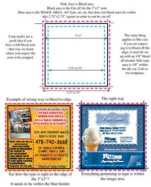
Image Size
For a Stick-On the image area should be 1/8 of an inch inside (safe type area) the finish size to avoid type cut off. For example on a 3 X 3 Stick-On the image area is 2.75 X 2.75. For a full bleed, please allow 1/8 inch beyond the 3 x 3 box. This applies to the square and all die cut shapes. Crop marks are a good idea if you have a full bleed note, so we know where you expect the note to be cropped.
For a Single Sheet insert the image area should be 1/4 inch inside the finished. product size to avoid type cut off. For example on an 8.5 X 11 the image area is 8 X 10.5. Image Area of 11 X 17 single sheet insert is 10.5 X 16.5.
Full Bleed
Please include crop marks on PDF file to show where trim is expected.
Stick-On Ads: Allow additional 1/8” on all sides that bleed
Single Sheets: Allow additional 1/4” on all sides that bleed.
Finished size for 8.5 X 11 Single Sheets that bleed is
8.25 X 10.5 after trim.
Finished size for 11 X 17 Single Sheets that bleed is
10.5 X 16.5 after trim.
Color
Include all Process/PMS colors with the file
Remove all unused color from the file. Only the colors printing should be used in the art file and visible in the swatches palette.
Please be sure to define all colors as process colors (CMYK) unless you intend to use an actual spot color.
Your monitor will usually not display accurate colors and should not be trusted for precise color control and final color decisions. Monitors and color printers are all calibrated differently and do not represent the effects that dot gain may have on an image. Therefore, when selecting colors for use in your print work, it is recommended that you use a Pantone Matching System, a PMS process color swatch book or a TrueMatch process color swatch book. The swatch books will provide accurate representations of how your colors will print. We can print a maximum of 4 PMS colors. When using spot color on your project, make sure they are named exactly the same throughout all programs used to create your job. TIP: Create your graphics in Photoshop, Illustrator or Freehand first, and place them in your final file, then use the color that appears in the color palette to color-break your file. Although CMYK reproduction is widely used in flexography, there are many instances where the use of spot colors is preferable, or even necessary.
For best results, use spot colors in the following circumstances:
When consistency of a specific element such as a logo or background color is important.
To maintain optimal legibility use a spot color for text.
For elements that require vibrant color, spot colors should be utilized.
CMYK Guidelines
If you expect a true yellow use 100% yellow with no additives. For example: Do not mix 5% cyan with 100% yellow the end result will be a light lime yellow. If you expect a true red use 100% Magenta and 100% Yellow with no additives. Adding Cyan or Black will cause it to be darker or muddier looking. Make sure your black text is not on all 4 plates. Keep in mind that custom colors that are converted to CYMK do not always maintain their original brilliance or hue.
Ink Coverage
Total ink coverage refers to the allowable ink values in the darkest areas of photos and screen tints. The total percentage of all four process inks (CYMK) is added together to determine the total ink coverage. Uncoated or matte paper should have total ink coverage limited to 280% and coated paper to 320%.
Type
All text should be created in vector format, this includes Illustrator, QuarkXPress, and Freehand. Vector artwork consists of lines and curves that form shapes stored as a series of mathematical instructions. Vector based graphics and text will have smooth edges. Text created in raster-based programs like Adobe Photoshop or other raster based programs will have jagged, rastered edges, making smaller text difficult to read. All fonts must be embedded in the high resolution, press quality, PDF file.
The smallest typeface recommended is:
•5 pt when typeface is solid black
•7 pt when typeface is in a color
•6 pt when typeface is a white reverse on black
•7 pt when typeface is reversed on any colored background
Any type below these recommendations may not be legible when printed. We do NOT recommend using condensed or serifed fonts for reversed-out text, as the thinner portions of the letters will have a tendency to fill in. Watch for any areas of the text that are less than .01 of an inch in thickness as these may not reproduce well. Please be aware that the addition of a drop shadow to reverse text introduces an additional color to the back-ground, meaning that the background color and the drop shadow color would have to be in perfect registration in order to create the shape of the letters properly. For this reason, we discourage the use of drop shadows, particularly on small reverse text. If a drop shadow is required, we recommend adding a gap between the light-colored text and the drop shadow on larger text or a single-color key-line/drop shadow combination on smaller text so that the shapes of the letters appear only on one plate.
Line Weight
All Line weight should be defined as .25 point or greater. Never select hairline weights, they will do not reproduce well. Some programs define hairline as 1 pixel, and try to print at 1/2540ths, which may be invisible and not print at all.
Gradients
The smallest dot that can be etched onto a flexographic (Stick On Ad press) printing plate may be as small as 2% but may gain as much as 12% on the press due to the nature of the photopolymer plate material and the printing process. This effect is most noticeable in gradients that are intended to have a soft gradation to 0%. These will stop graduating below 12% and will end in a hard line where the gradient drops to 0%. Please keep screens at 4% or more. Screens over 95% may appear as solid colors due to press dot gain.
Bar Codes
Make sure that the bar code prints in a scannable color. Since most bar code scanners utilize infrared light, avoid using inks with red or orange pigments. For best results, we recommend that bar codes appear on a white background. Make sure to allow a no-print area of at least 1/8” to the left and right of the left and right bars of the code. In order to avoid potential distortion, the code must be placed so that the bars run through the press in the same direction that the film runs through the press.